The Delight Conference, run by Connective DX in Portland, is billed as a unique two day gathering of designers, technologists and businesses that care about creating experiences people love
Part 1 of 3
Having had a few of weeks to reflect since attending the Delight Conference, what has bubbled to the top - what’s still resonating?
There are three things which are still ringing in my ears:
- We heard from every single speaker about organisational culture in one way or another - more below.
- Make sure you’re solving the right problem - get this bit right, and you can do some really awesome stuff.
- Yet the images which are still flashing before my eyes are the short clips that Josh Clarke showed of the possibilities for the future when we move away from using a screen as an interface.
This is the first of 3 blog posts which explore these themes further.
It’s a Culture Thing
Every single speaker mentioned organisational culture in one way or another, but why? User experience and employee experience are inextricably linked. At a conference about providing delightful customer experiences, the culture thing just can’t be ignored.
In this connected age, the traditional barriers between inside and outside the organisation are reduced or removed. You can no longer treat employees like shit whilst having “Respect” as one of your espoused corporate values and get away with it - you will be found out.
In a time of constant change, culture often puts the brakes on new things being adopted. As Peter Drucker famously said, “culture eats strategy for breakfast”. All the best policies and procedures in the world won’t trump culture.
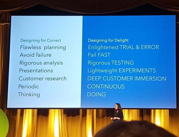
Suzanne Pellican of Intuit was the first to mention the C word, saying if you want to change the way your organisation works, and deliver the most delightful customer experience, you can’t afford to ignore organisational culture - see video. Culture change is a long game - she described Intuit’s 8 year journey to change an organisation of 8,000 people to become a customer focused, design driven tech company. Intuit changed from delivering a service via a CD Rom, which was sent out to customers infrequently to an online service - the culture had to move from designing for correctness to designing for delight - see the slide below. Some of their lessons learnt are worth a mention.
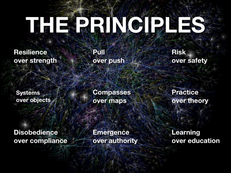
Suzanne describes how she started the journey by producing a process map for staff to follow, but 2 years on, nothing had changed. This isn’t surprising, when you consider Joi Ito’s set of principles for how to approach anything in the 'After Internet' world (see below).
“Compasses over maps: A good compass (and clear compass bearing) will allow you to reach your goal even if there are unforeseen circumstances. Roadmaps are only useful if every potential pitfall has been foreseen and calculated. This kind of foresight is extremely rare.”
There are always unforeseen circumstances, no matter how deliberately you plan something, especially if it involves people. Be prepared for that - know where you want to get to and be prepared to change your own plans or ideas in order to get there.
People didn’t initially understand how to do this new stuff. Suzanne had to show them how - and not just once. It took each individual 6 - 10 times of being exposed to design thinking for it to be embedded in their behaviours.
According to Suzanne, it’s fairly easy to get staff to come up with lots of ideas, but at Intuit, they were finding that they then selected the crappy ideas. If employees don’t initially know how to see the solution right through to the end, they won’t pick it. This wasn’t something I’d considered before, yet it’s one of those things that when you say it out loud it seems obvious.
At Intuit, they had to drive home the importance of selecting ideas that most delight the customer and embed this in their culture.
Ideation <=====> Easy
Selection <=====> Difficult
Execution <=====> Difficult
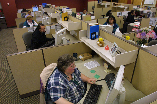
Aaron Taylor Harvey and Rachel Harvey designers of Airbnb’s Portland customer experience contact centre interior, were next to reference culture - see video. What they created looks nothing like the hell hole we’ve come to expect of typical call centres. Office layout and appearance is important because it is an expression of the organisational culture. It’s the first thing that people see when they visit or start with the business and therefore sets the mood for the interactions that take place within.
The typical call centre layout is based on the principles of openness, opportunity and hotesking (or freedesking - if you’re from the US), yet you typically end up with a sea of desks where the only place you can innovate is in your chair. There is limited variety and people get stuck in one place.
Aaron and Rachel wanted to create a high density office with variety - people like high contrast experiences, with space to lounge, stand and sit. People need different environments to work collaboratively or alone, to work creatively or check off the to-do list and to work on the laptop or work on paper. You don’t need to be sat with your laptop at a desk to do all of these things. In fact, it’s the least productive place to be if you want to be creative. John Cleese once said “We don’t know where we get our ideas from. We DO know we don’t get them from our laptops.”
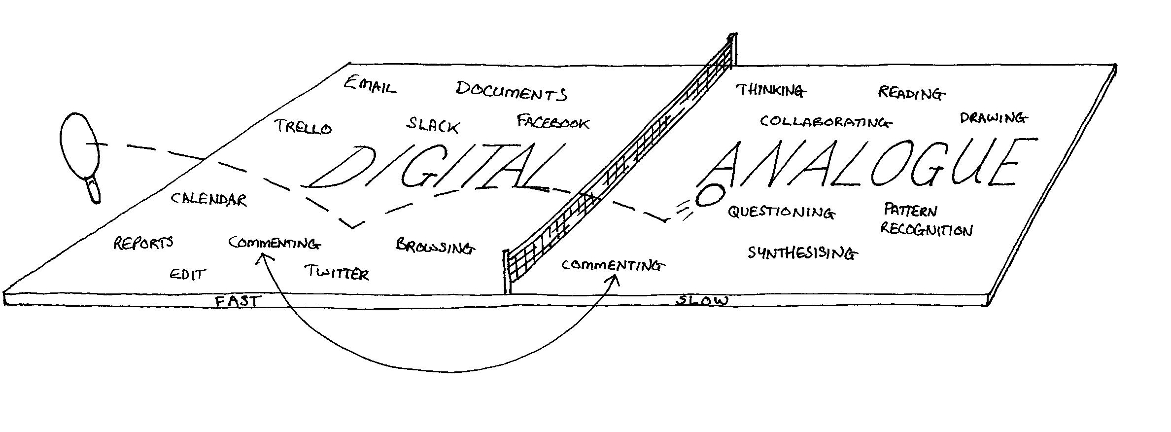
If you don’t provide variety, there is no incentive for people to move around. You need to have a meaningfully different experience if you move. If you want to tear down the silos, the office layout needs to encourage movement and at the core to motivate movement is providing variety.
The interior looks more like one of their listings than the inside of a call centre. There are standing desks where people keep their belongings and which acts as a base for when they first arrive in the office. Owing to different personal preferences, there are darker spaces and lighter spaces. There is space for different kinds of work - space for collaboration and more personalised space for individual work. The kitchen is an important hub for social interaction over lunch.
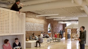

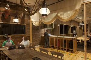
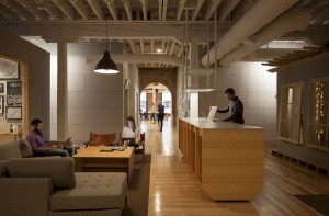
The result is an interior that people move around in, breaking down traditional silos and encouraging interaction when it’s wanted.
Quote of the conference came from Colin O’Neill of hosts Connective DX - “often a brand promise is an aspirational word salad”. We often find with our work on organisational values that the words painted on the walls at reception bear no relation to reality. You know the sort of thing - hollow values with insufficient explanation such as: integrity / respect / excellence / communication” - hang on a minute, weren’t those Enron’s values?
Posting corporate values on the wall and in reports does nothing and is harmful if the organisation doesn’t actually live up to them. This kind of activity is counter productive and erodes trust - if you can’t be honest about this, then what else are you hiding?

We heard “it’s a culture thing” a lot over the first day. If you want to deliver delightful customer experiences, your organisation needs to be fit and healthy on the inside. Participants at the conference recognised this too and flocked to our day 2 workshop on Culture Mapping.
The Culture Map is a change management tool developed by Dave Gray with Alex Osterwalder, Strategizer. We’ve been using it in the real world for about a year and we went to the conference to show people how to use it and to share our insights from using the tool. You can see our workshop slides here: bit.ly/satoridelight
If you want to find out what’s really going on in an organisation, you need to take a forensic look at the culture through the eyes of the employees, not just from the perspective of the senior leaders. We think the new Culture Map designed by Dave Gray and now part of the Strategizer suite of tools is a great way to do this and we’ve been deploying it successfully with clients here in the UK. Check out Culture Mapping to find out more.
About a month before the conference, Dave Gray said that he’d join us in the workshop - this just about doubled our learning quotient and it was worth the trip just to see Dave being expertly mapped by Derek Phillips and Tom Bennett with his own tool.
Look out for part 2 of this blog next Friday.
Love it! @davegray being Culture Mapped at our Workshop #DelightConf pic.twitter.com/5GUsoBU9Ry
— The Satori Lab (@TheSatoriLab) October 6, 2015


Pingback: What a Delight: the Internet of Things - The Satori Lab
Pingback: What a Delight: Fall in love with the problem - The Satori Lab